Chartosaur Blog

Practical takes on data visualization and storytelling.

Isochrones

Mapping Access in Minutes, Not Miles

October 5, 2025|
MapsUrban PlanningData VisualizationResource
Isochrones: Mapping Access in Minutes, Not Miles
Image: Jono Hey, Sketchplanations

Most maps push us to think in distance, but some decisions need minutes. Isochrones swap miles for time and show what you can actually reach.

China vs. the World in Solar

Side by Side

September 21, 2025|
SolarComparisonCommentary
China vs. the World in Solar: Side by Side
Chart by Ember Energy

China's solar expansion is really highlighted in this chart. In just the first half of 2025, it added 256 GW, more than double what the rest of the world managed combined. That's the headline, and this chart from Ember delivers it with confidence.

A Clean, Striking Chart

With One Smoothing Slip

April 30, 2025|
Line ChartsCommentary
A Clean, Striking Chart: With One Smoothing Slip

This chart from @Barchart caught my eye right away. It shows a major economic shift—the top 1% of U.S. earners now hold more wealth than the entire middle class. That's a powerful story—and the chart tells it clearly. Almost.

Where the Sun Shines

Daylight & Solar Intensity Across Cities

April 15, 2025|
HeatmapCommentary
Where the Sun Shines: Daylight & Solar Intensity Across Cities
Credit: @naspli on r/dataisbeautiful

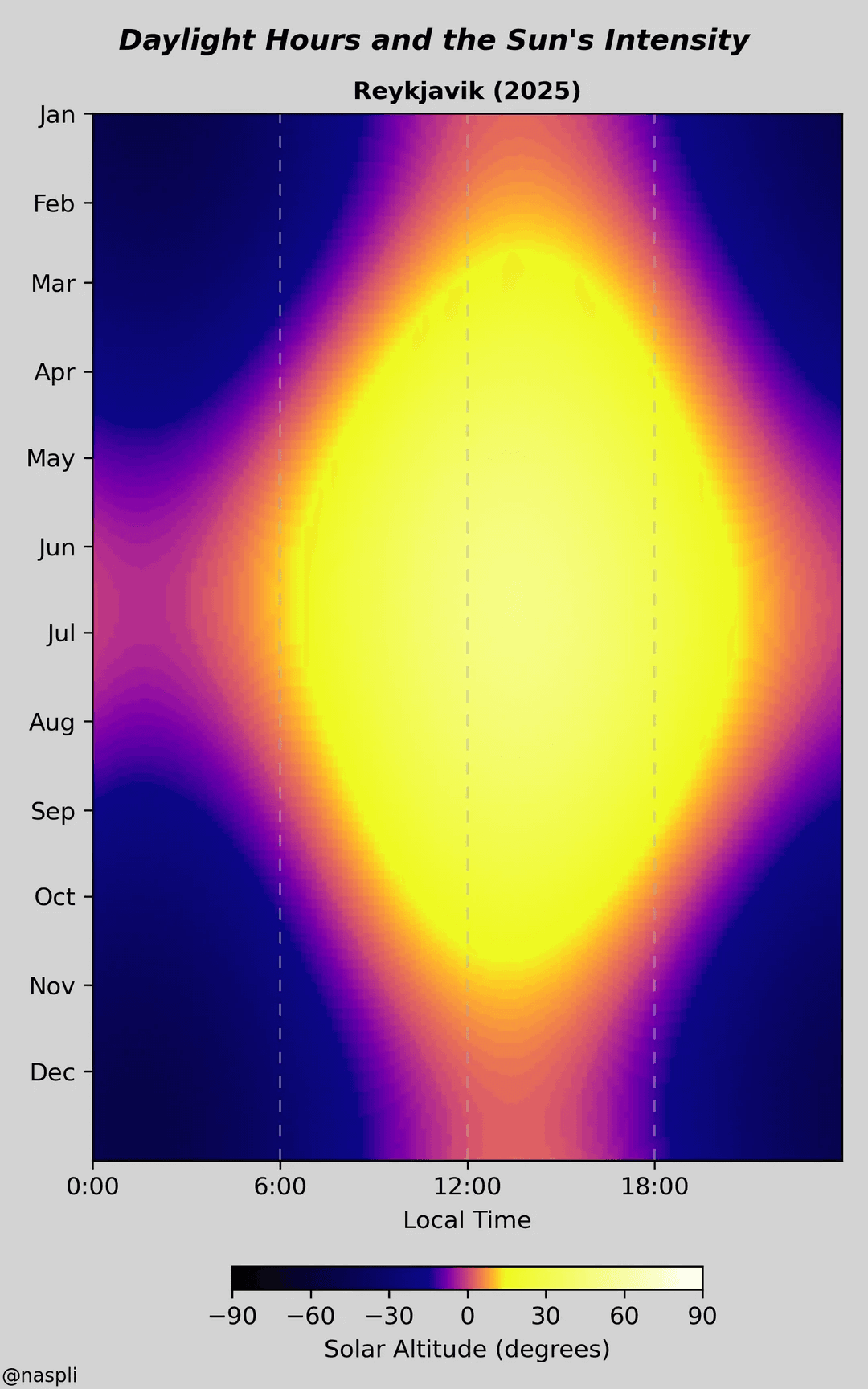
Came across this visualization by @naspli in r/dataisbeautiful and had to share. It shows how daylight and sun intensity change over the year in different cities—and it does it in a really clear, elegant way.

Fragging Beautiful

A 3D Look at CS2’s de_dust2 Kill Zones

April 7, 2025|
3DDensity PlotCommentary
Fragging Beautiful: A 3D Look at CS2’s de_dust2 Kill Zones
Credit: @smartbackwards on Reddit

I came across this gem on Reddit and had to share. It's a visual breakdown of where frags happen on de_dust2 in pro CS2 matches—and it's a great case study in when 3D does work in data viz.

Online Gambling

Bar Chart

April 2, 2025|
Bar chartsLayoutRevenueSports BettingCommentary
Online Gambling: Bar Chart
Credit: New York Times

When we talk about online gambling, sports betting usually grabs the spotlight, especially with big events like the Super Bowl or March Madness. But this chart makes it crystal clear—online casinos quietly rake in far more tax revenue than sports betting, at least in these six states.

Waffling AI Citations

How Bad Are AI Search Engine Citations?

March 30, 2025|
Waffle ChartPie ChartCommentary
Waffling AI Citations: How Bad Are AI Search Engine Citations?
Credit: Tow Center for Digital Journalism at Columbia's Graduate School of Journalism

AI-powered search engines often talk a big game, confidently serving up quick answers to our queries. But the reality of their citations tells a different—and troubling—story.

Dashboards That Actually Get Used

A guide to solving a common pain point

March 24, 2025|
DashboardsFrameworkLayoutResource
Dashboards That Actually Get Used: A guide to solving a common pain point

Most dashboards end up ignored. You spend weeks in meetings, invest in new tools, launch something that looks great, and a week later nobody's using it. Usually the dashboard just isn't clear or useful enough to make people want to come back.