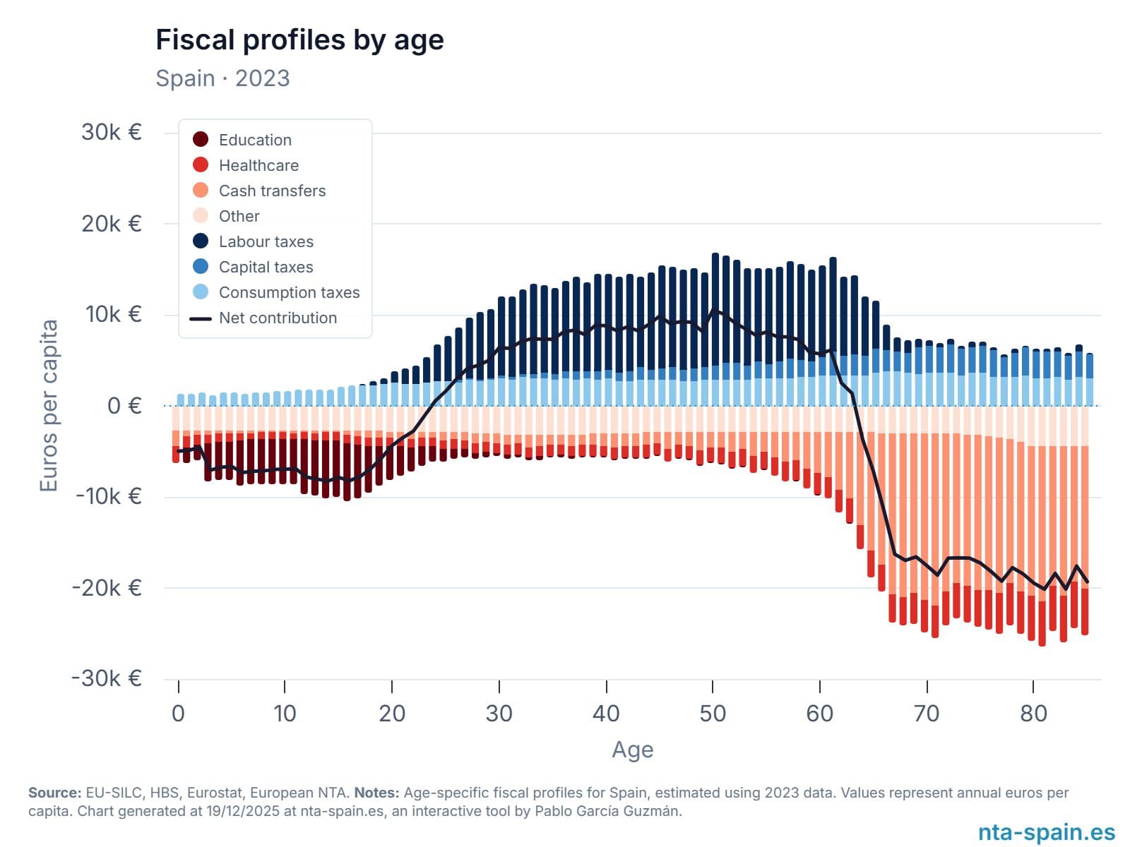
Chartosaur Blog

Practical takes on data visualization and storytelling.
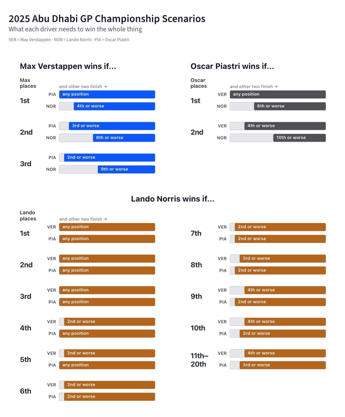
Another A.I. Model, Another Chart Sin

November 25, 2025|
Bar ChartsMisleading ChartsCommentary
Another A.I. Model, Another Chart Sin
Chart by Anthropic

Claude Opus 4.5 launched yesterday. The benchmarks look impressive, but the promotion charts might be slightly exaggerating its performance lead.

Visualizing My Journey to 100k followers

November 22, 2025|
Data StoryData DiveBronto Explores
Visualizing My Journey to 100k followers

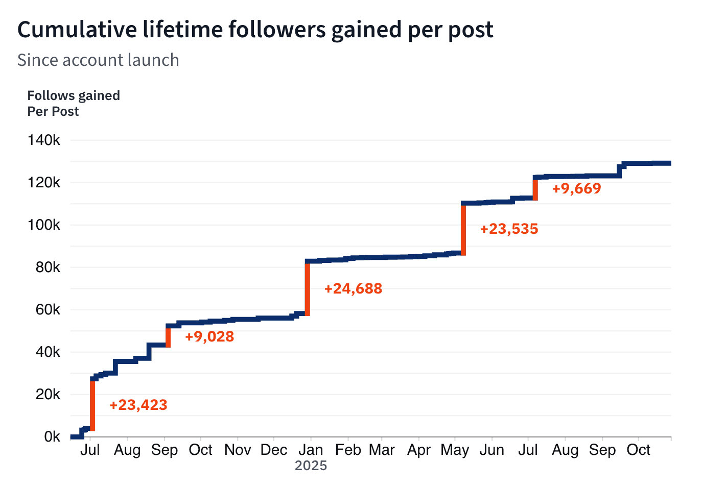
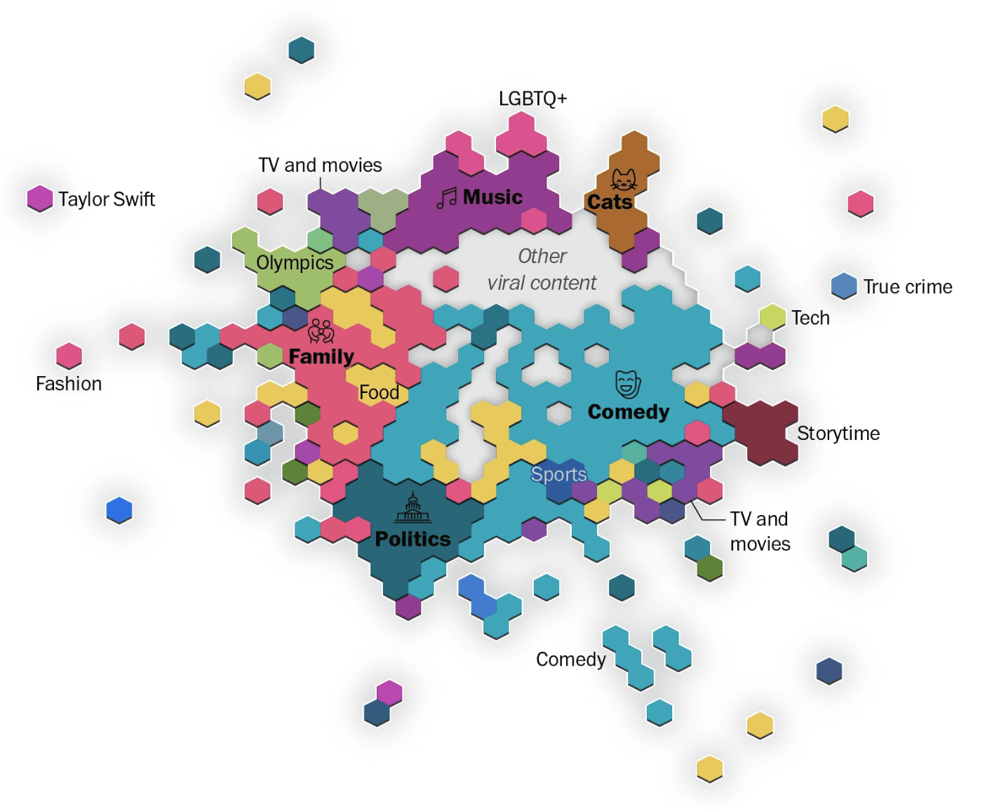
Not all posts are created equal. After analyzing 72 posts since I've launched @chartosaur on instagram, a clear pattern emerged: a small number of viral posts drove the majority of growth. Here's what really matters for social media growth.

Two Panel Chart Design

Why Color Choices Matter

November 19, 2025|
ColorStacked AreaMulti-Panel
Two Panel Chart Design: Why Color Choices Matter
Source: IEA

This IEA figure shows powertrain mix and regional sales. The layout works, the data is clear. But one design choice quietly suggests connections that aren't there.

Choosing Histogram Bins

A Mathematical Starting Point

November 16, 2025|
ToolsHistogramsResource
Choosing Histogram Bins: A Mathematical  Starting Point

Calculate a good starting point for optimal histogram bins from your data. A practical guide to the Freedman-Diaconis rule.

Social Media Usage

When Small Multiples Beat a Single Chart

October 14, 2025|
Small MultiplesLine ChartsTrendCommentary
Social Media Usage: When Small Multiples Beat a Single Chart
Source: @gregisenberg

The win here isn’t the data, it’s the layout. Small multiples for each age group in light blue, plus one dark-blue total. You see the pattern for every segment and the pattern for the world without six lines wrestling on one chart.

Isochrones

Mapping Access in Minutes, Not Miles

October 5, 2025|
MapsUrban PlanningData VisualizationResource
Isochrones: Mapping Access in Minutes, Not Miles
Image: Jono Hey, Sketchplanations

Most maps push us to think in distance, but some decisions need minutes. Isochrones swap miles for time and show what you can actually reach.

China vs. the World in Solar

Side by Side

September 21, 2025|
SolarComparisonCommentary
China vs. the World in Solar: Side by Side
Chart by Ember Energy

China's solar expansion is really highlighted in this chart. In just the first half of 2025, it added 256 GW, more than double what the rest of the world managed combined. That's the headline, and this chart from Ember delivers it with confidence.

A Clean, Striking Chart

With One Smoothing Slip

April 30, 2025|
Line ChartsCommentary
A Clean, Striking Chart: With One Smoothing Slip

This chart from @Barchart caught my eye right away. It shows a major economic shift—the top 1% of U.S. earners now hold more wealth than the entire middle class. That's a powerful story—and the chart tells it clearly. Almost.