Social Trust on a Line
December 3, 2025 • 2 min read

Chart by Pew Research Center
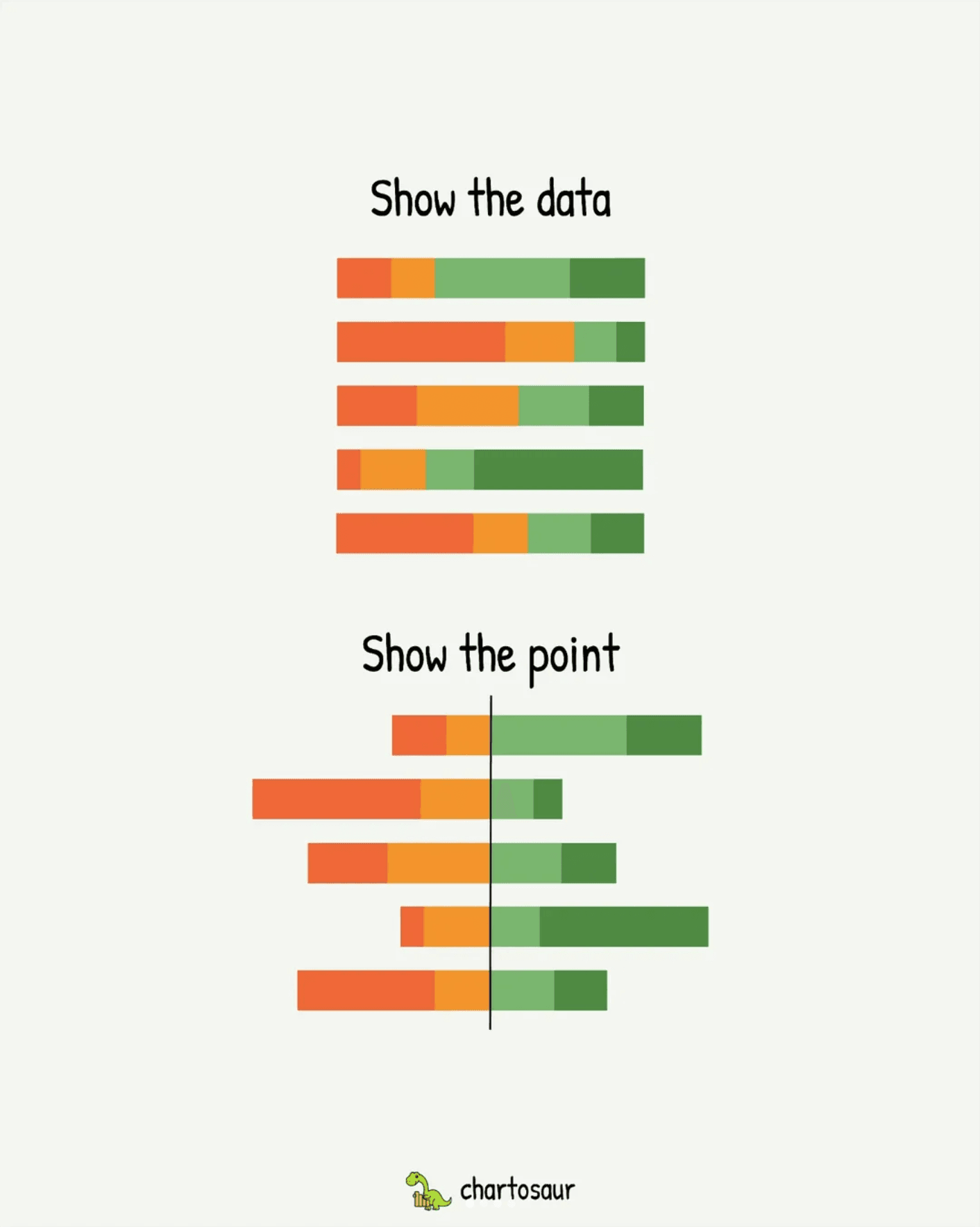
This chart has a simple job: show where most people trust others and where they don’t. The design serves that purpose and keeps it front and center.
The key move is the vertical anchor line in the middle. All of the Cannot bars grow to the left. All of the Can bars grow to the right. Once you see that rule, you can skim down the list and feel the balance for each country without doing any mental math.
I broke this trick down in a viral Instagram post to illustrate how effective it is:
A title and medians that match
The title is plain language:
Social trust is higher in wealthier countries, lower in middle-income countries
It states the pattern without hype. While hype sometimes has its place, it also can make the viewer skepticial. This title feels like it's letting the data speak for itself.
The medians really help 'prove' the title. There is less effort on the reader's part to figure out the overall pattern because the medians summarize it for you.
- One row for the high income median.
- One row for the middle income median.
If you only read the title and those two rows, you already have the key idea. The rest of the countries give texture, not a new story.
It is a good reminder that when the structure is strong, you do not need clever styling. Pick the job, build a layout that makes that job easy, then stop.