
•3 min read
Look Beyond the Bar Chart
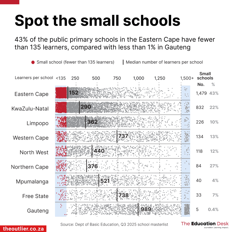
I recently came across this interesting visualization showing how the size of public primary schools varies across South Africa.
DatavizCommentary

We help teams turn data into clear, compelling visual stories. From training workshops to custom charts and complete report & dashboard redesigns, our studio brings expertise in data visualization to every project.
Live workshops on data storytelling and visualization fundamentals. Strengthen your team's visual communication with practical, hands-on guidance on chart selection, design clarity, and data-driven storytelling.
Explore
Send us the reports and dashboards your team relies on. We review every chart, layout, and narrative flow, then deliver a prioritized action plan to sharpen clarity and fix what isn't working.
Explore
Used by professionals in 60+ countries!
Everything you need to create charts that drive decisions. Explore insights, frameworks, and resources to help you present data with confidence.
Explore the Playbook→
Practical takes on data visualization and storytelling
I recently came across this interesting visualization showing how the size of public primary schools varies across South Africa.
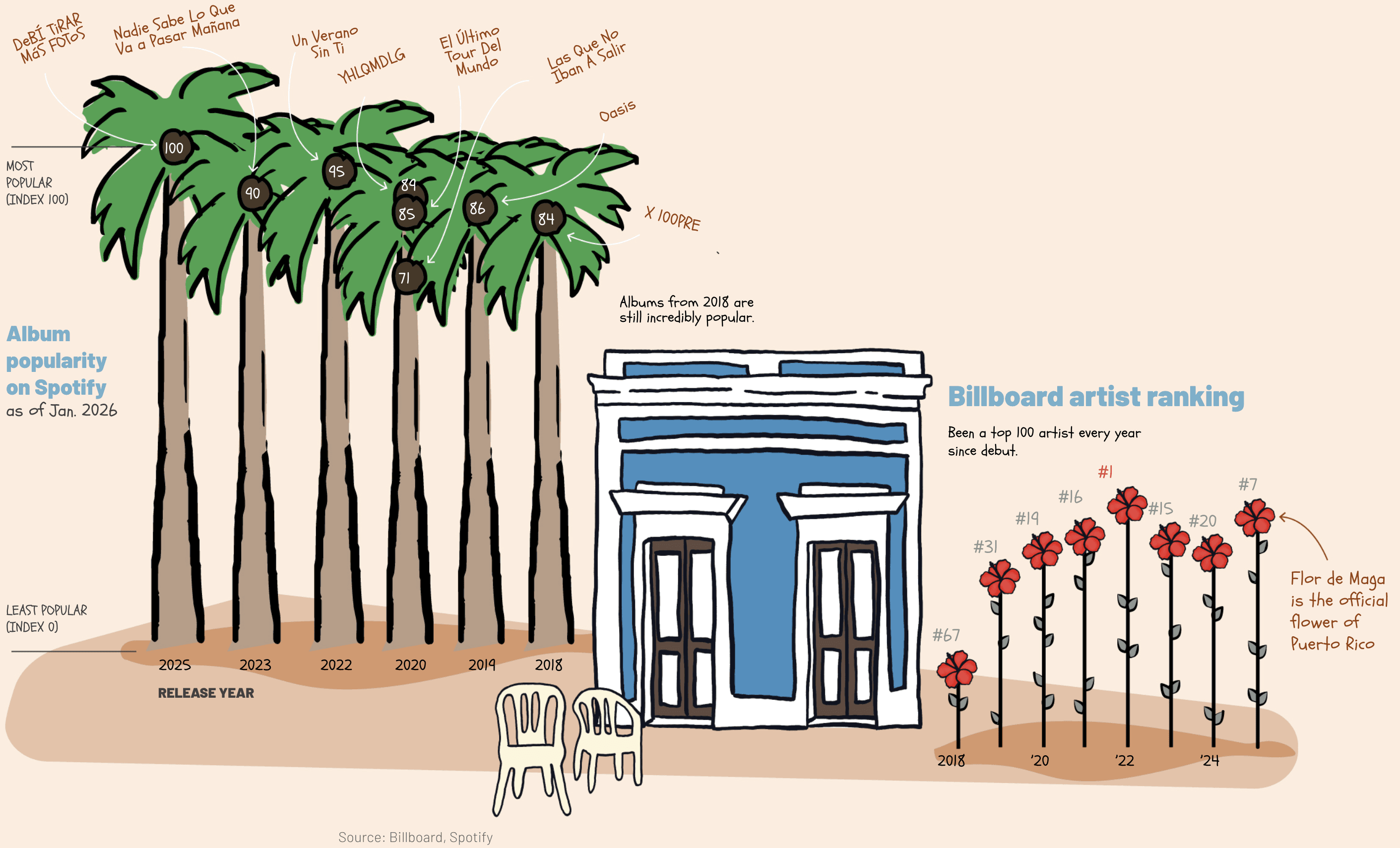
Usually on my page, you see me highlighting simplicity and clarity in charts. That's typically my audience, a boardroom full of executives who need to understand the data quickly. But charts are also used for the public eye, and sometimes the goal can be to catch attention and make the data memorable.

You want to visualize the results of one survey question so it feels natural to put everything in one chart, but in this case it's likely making the results harder to digest.
Actionable tips and frameworks delivered straight to your inbox.
+ Instantly get a FREE 21-step interactive checklist!