Charts That Take the Shape of the Data
October 3, 2026 • 4 min read
Usually on my page, you see me highlighting simplicity and clarity in charts. That's typically my audience, a boardroom full of executives who need to understand the data quickly. But charts are also used for the public eye, and sometimes the goal can be to catch attention and make the data memorable.
That’s the appeal of charts that take the shape of their subject. They can catch your attention because you recognize the thing, then use its shape or layout to help explain the numbers. Sort of like infographics, but one step closer to real charts rather than a gimmick. I've gathered a few I could find across the web that I found particularly interesting...
Palm trees and flowers for a Super Bowl halftime act
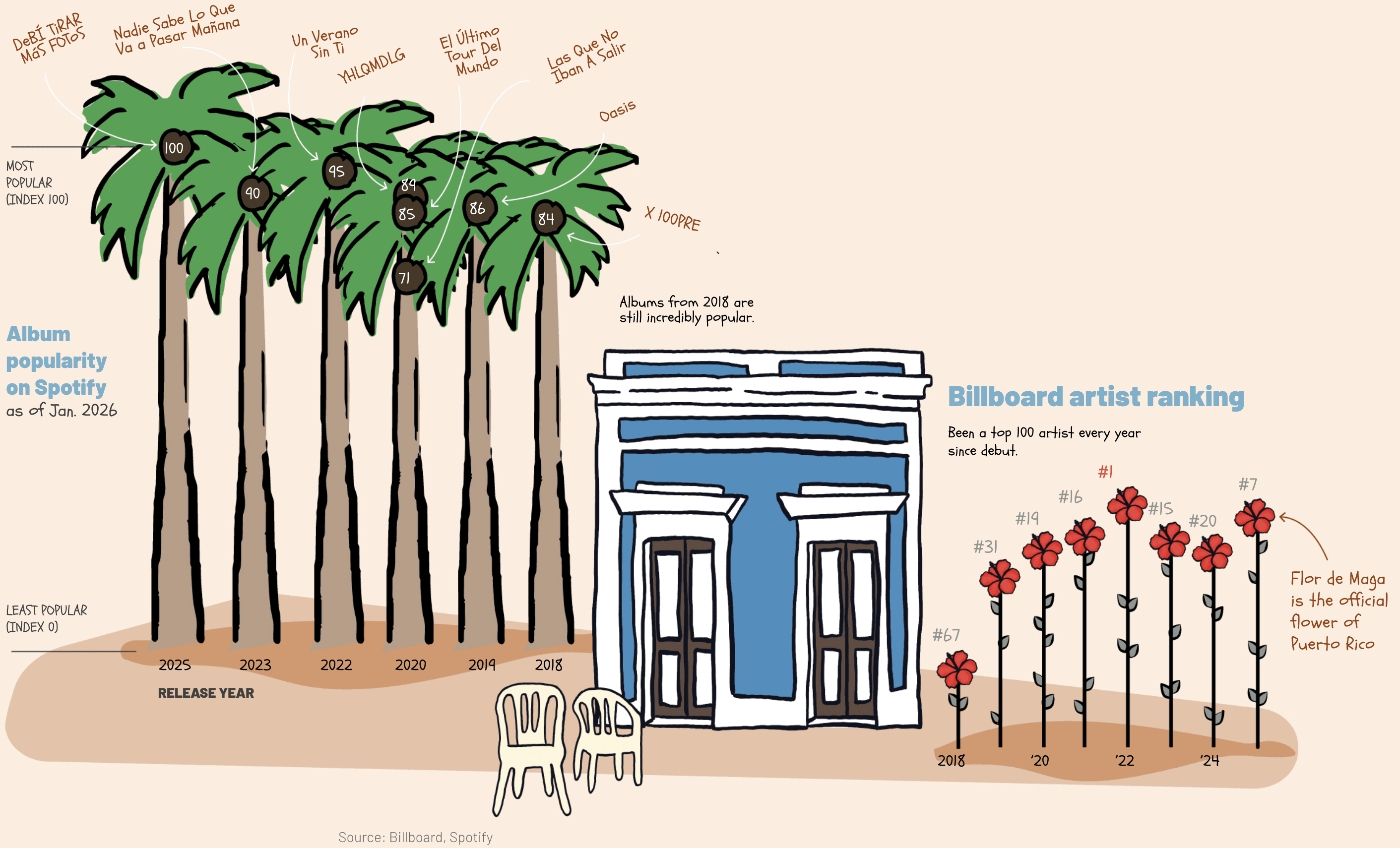
Immediately eye-catching, right? So this is essentially just a bar chart, but dressed beautifully to look like palm trees and flowers. The heights (just like a regular chart) show the popularity of Bad Bunny's albums on Spotify, and the flowers show the rankings. The goal was to grab attention, be shareable, and be memorable. And I'd say it did a good job, without losing the data.
Book data on a bookshelf
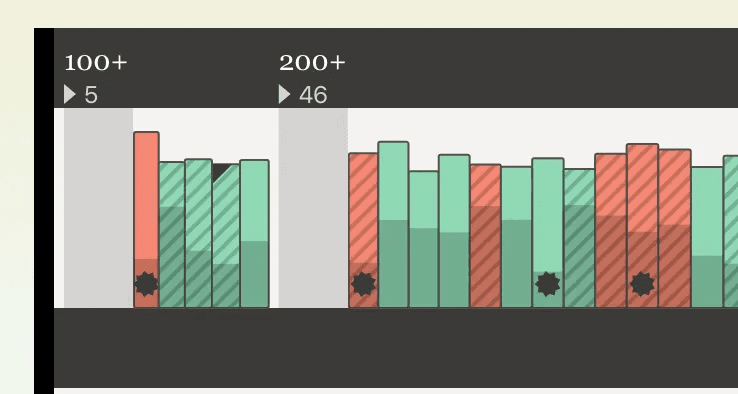

This is a really cool project I stumbled across while searching for examples for this blog post. Tanyoung Kim has borrowed the form of a physical bookshelf to visualize the data from the books the New York Times named best of the year from 1996 onward. There are layers built into the design with a legend explaining it all, although some are intuitive, like the width of the book spines representing the number of pages.
Seat preferences inside the airplane
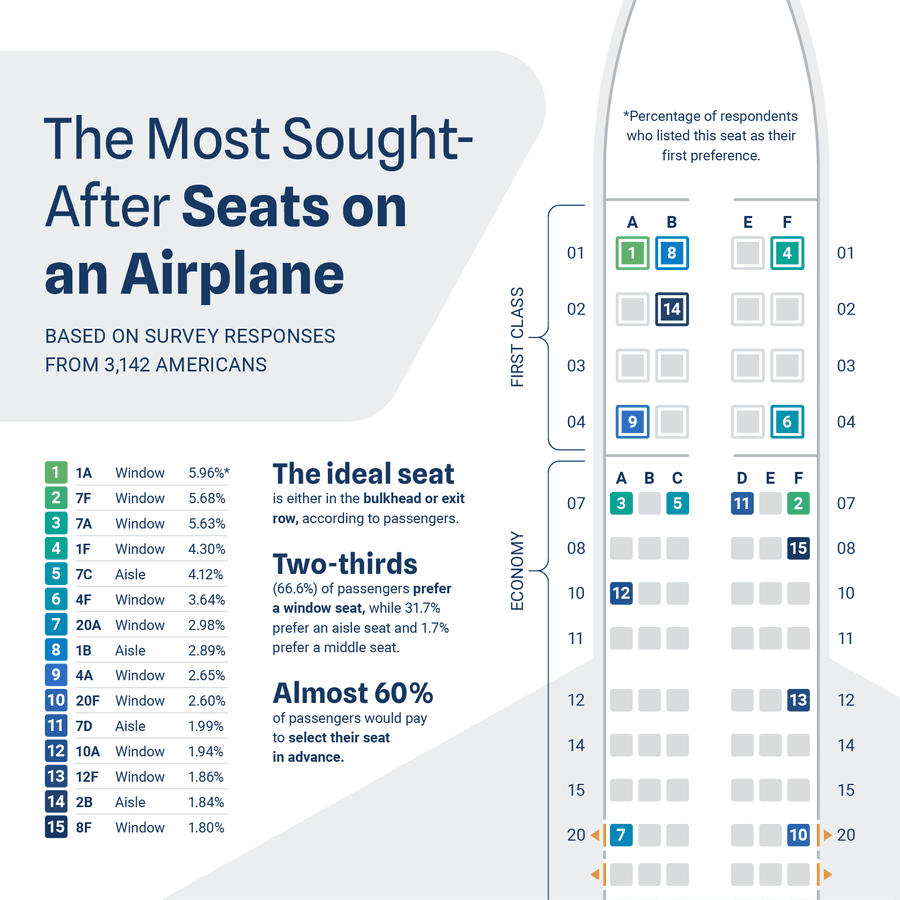
This one is quite straightforward, using the plane seats visual to plot the data directly. Imagine it was a gridded plot like A1, A2, A3,... all equally spaced. I'm sure it would be lost on most readers which ones are middle seats and which ones are window seats. The airplane shape makes it immediately clear. You'll also see this a lot in sports data where the field or court is used to show the data in its natural context.
Dentist visits in a row of teeth
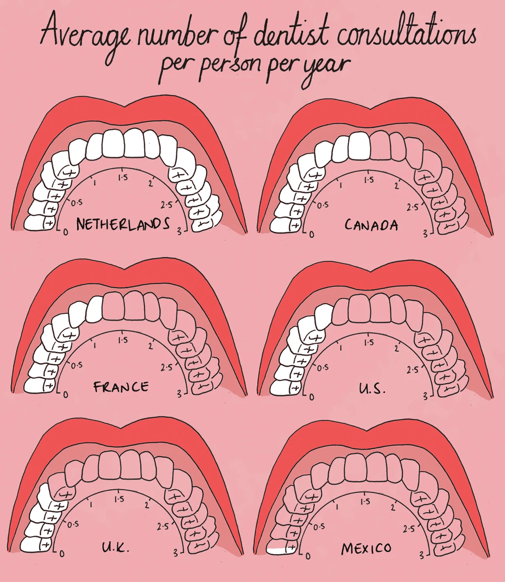
Now this one is really out of the box and beautiful. Mona Chalabi has used the shape of a mouth to show the average number of dentist visits per person per year across countries. It's basically a radar chart in disguise, and although you may have seen me be harsh on radar charts (especially in dashboards), I think this one gets a pass. Especially for its context, a chart on social media, it's scroll-stopping and memorable.