Look Beyond the Bar Chart
October 12, 2026 • 3 min read
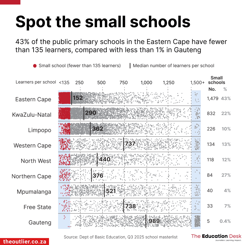
I recently came across this interesting visualization showing how the size of public primary schools varies across South Africa.
The visualization comes from The Outlier, a data journalism publication based in South Africa. It shows the distribution of school sizes across the country, with each dot representing a school. Schools with fewer than 135 learners are shown in red, which the viz refers to as micro schools.
What I really like is how they've chosen to show this data. A straightforward way to do this would've been to use a bar chart to compare the percentage of micro schools across the different provinces. But I like that they've gone beyond that.
Notice how they've managed to keep the entire distribution visible without making the chart feel too cluttered. The gray dots give us a sense of how school sizes vary across each province, but they're subtle enough that our attention still goes to the micro schools.
Also note the median markers on this chart. For example, the Western Cape and Free State have almost identical medians of 737 and 738 learners, but 13% of schools in the Western Cape are micro schools compared to just 7% in the Free State.
The provinces are ordered by the number of micro schools, from highest to lowest. Interestingly they're not sorted by percentage, which is what the subtitle focuses on. I wonder if sorting them by percentage would've made more sense here, but I do like that they've included both numbers on the right.
There are a few smaller design choices worth appreciating too. The gridlines are dotted and barely visible, and the thin horizontal lines help separate the provinces. It's just enough structure to make the chart easier to follow without adding too much visual clutter.
You'll also notice the light blue shading on either end of the chart. The left side marks the cutoff for micro schools (fewer than 135 learners), while the right groups together schools with more than 1,500 learners.
Look at that 1,500+ group on the right. When you're showing a distribution like this, a few unusually large outliers can end up stretching the entire axis and squeezing everything else together. By grouping the schools above 1,500 into their own section, they've managed to keep the outliers visible without sacrificing space that could be used to show the rest of the distribution. We do lose the exact sizes of those larger schools, but I think it's still pretty honest and transparent here, especially since they've shown the median for each province on the chart.
For anyone wondering, this type of chart is called a jittered strip plot and I think it's a great way to show distributions when you have a lot of individual data points. Each dot is positioned according to its value, with a little random vertical movement added to minimize overlap.
Unfortunately, it's not a chart you'll find in Excel's default options, although you can hack one together using a scatter plot and some random jitter. Seaborn and Plotly have options for creating strip plots in Python, while ggplot2 can do the same in R.
Overall, I think this is a really nice example of how much you can show in a single chart without making it difficult to read. There's enough here to spend some time exploring the distributions, but you can also get the main point in just a few seconds. And I think that's what makes it work so well.