Another A.I. Model, Another Chart Sin
November 25, 2025 • 3 min read
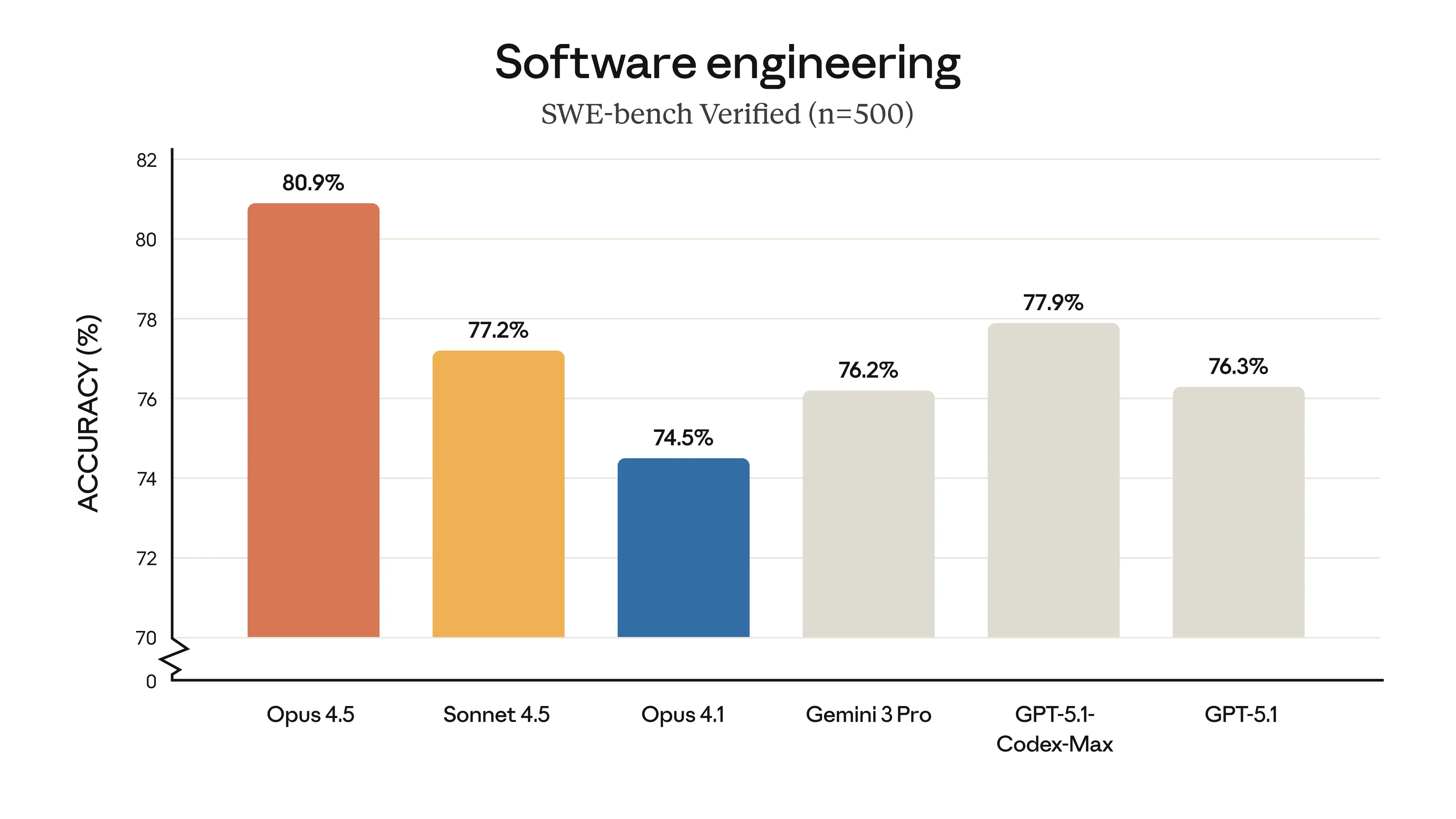
Chart by Anthropic
Another week, another model launch. This time it's Claude Opus 4.5.
If you're keeping track, we've been through this loop before. Grok drops. Everyone claims they're best. Then OpenAI. Then Gemini. Then Claude. Round and round.
![[object Object]](/_next/image?url=%2Fblogs%2Fanother-ai-model-another-chart-sin%2Fcycle-meme.png&w=3840&q=75&dpl=dpl_J2PmofTT1qPAhZEnNnbdnK3FejMe)
And with each release comes the same benchmark charts flooding social media claiming dominance.
The chart from Anthropic caught my eye this time, as it commits one of the classic sins of chart design.
![[object Object]](/_next/image?url=%2Fblogs%2Fanother-ai-model-another-chart-sin%2Fgunnarmorling-tweet.jpeg&w=3840&q=75&dpl=dpl_J2PmofTT1qPAhZEnNnbdnK3FejMe)
@gunnarmorling captures the image perfectly with this emoji reaction.
Your brain doesn't read the numbers first. It reads the bar lengths. That happens automatically, pre-attentively. And because the purpose of the chart is for marketing, those bar lengths are doing the heavy lifting of persuasion.
So when Opus 4.5's bar is twice as tall as Opus 4.1's bar, your brain registers: twice as good. But really, it's an 8.6% relative improvement.
@alonsosilva nailed the idea with a perfect parody.
![[object Object]](/_next/image?url=%2Fblogs%2Fanother-ai-model-another-chart-sin%2Falonsosilva-joke.jpeg&w=3840&q=75&dpl=dpl_J2PmofTT1qPAhZEnNnbdnK3FejMe)
How the Community Fixed It
![[object Object]](/_next/image?url=%2Fblogs%2Fanother-ai-model-another-chart-sin%2Feiselems-fix.jpeg&w=3840&q=75&dpl=dpl_J2PmofTT1qPAhZEnNnbdnK3FejMe)
Thank you to @eiselems for the fixed image. This redesign uses a zero baseline, so the bar lengths accurately reflect the performance differences.
This is why it's important to always look at the choices behind a chart. If a chart trims the baseline, it is likely because someone wanted the jump to look bigger. When it's a cooperation of this size, it's unlikely to be an accident...
And seeing the bars this close now, something I can't help but wonder is how the error bars would look like, buuuut let me not open that can of worms today.