A Clean, Striking Chart
With One Smoothing Slip
April 30, 2025 • 3 min read
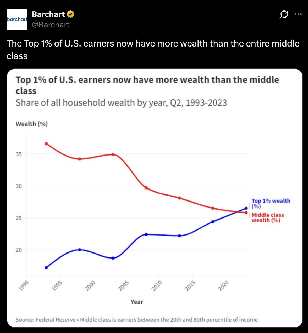
This chart from @Barchart caught my eye right away. It shows a major economic shift—the top 1% of U.S. earners now hold more wealth than the entire middle class. That’s a powerful story—and the chart tells it clearly. Almost.
The layout is solid: two simple lines, a direct title, no distractions. It gets straight to the point. The top 1% (in blue) climbs steadily over 30 years, while the middle class (in red) gradually declines. You can see the lines cross around 2023. It’s clean, easy to understand, and visually strong.
But there’s one problem: the smoothed curves.
They look nice, sure. But they’re also misleading. Smoothing lines like this suggests something that isn’t there—like the data is continuous or gently flowing between quarters. It’s not. These are discrete data points, measured at specific times, and the curve in between is just guesswork. In some spots, it might even imply a trend that didn’t happen.
With time series data like this—especially on a topic as sensitive as wealth inequality—it’s important to be precise. A straight line between each point keeps the message accurate and grounded. No extra flourishes, no accidental exaggeration. The data already tells a dramatic story. It doesn’t need help.
So, credit where it’s due: this chart is bold, clear, and brings attention to a real issue. Just drop the smoothing next time. When the lines matter this much, they should stick to the facts.