Where the Sun Shines
Daylight & Solar Intensity Across Cities
April 15, 2025 • 5 min read

Credit: @naspli on r/dataisbeautiful
Came across this visualization by @naspli in r/dataisbeautiful and had to share. It shows how daylight and sun intensity change over the year in different cities—and it does it in a really clear, elegant way.
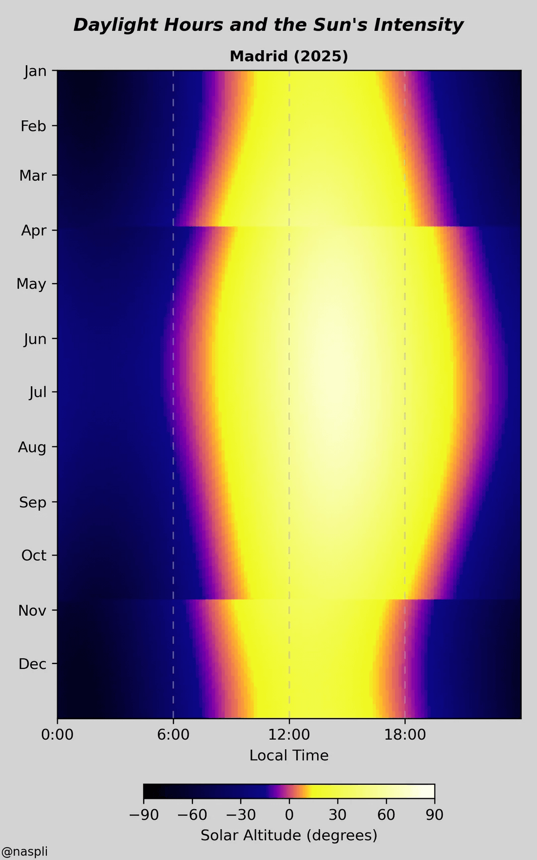
Each row is a day of the year, each column an hour of the day. The colors do the talking: bright yellows mean strong sunlight, deep blues mean darkness. It’s a great use of heatmaps—perfect for showing patterns that change over time and across places.
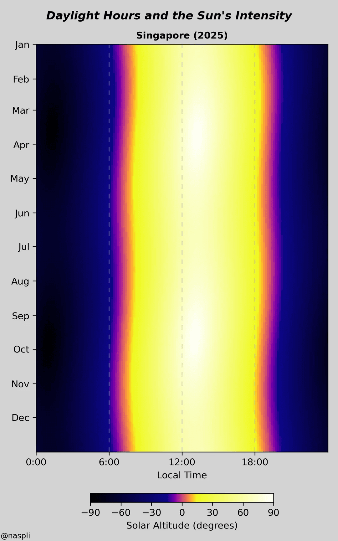
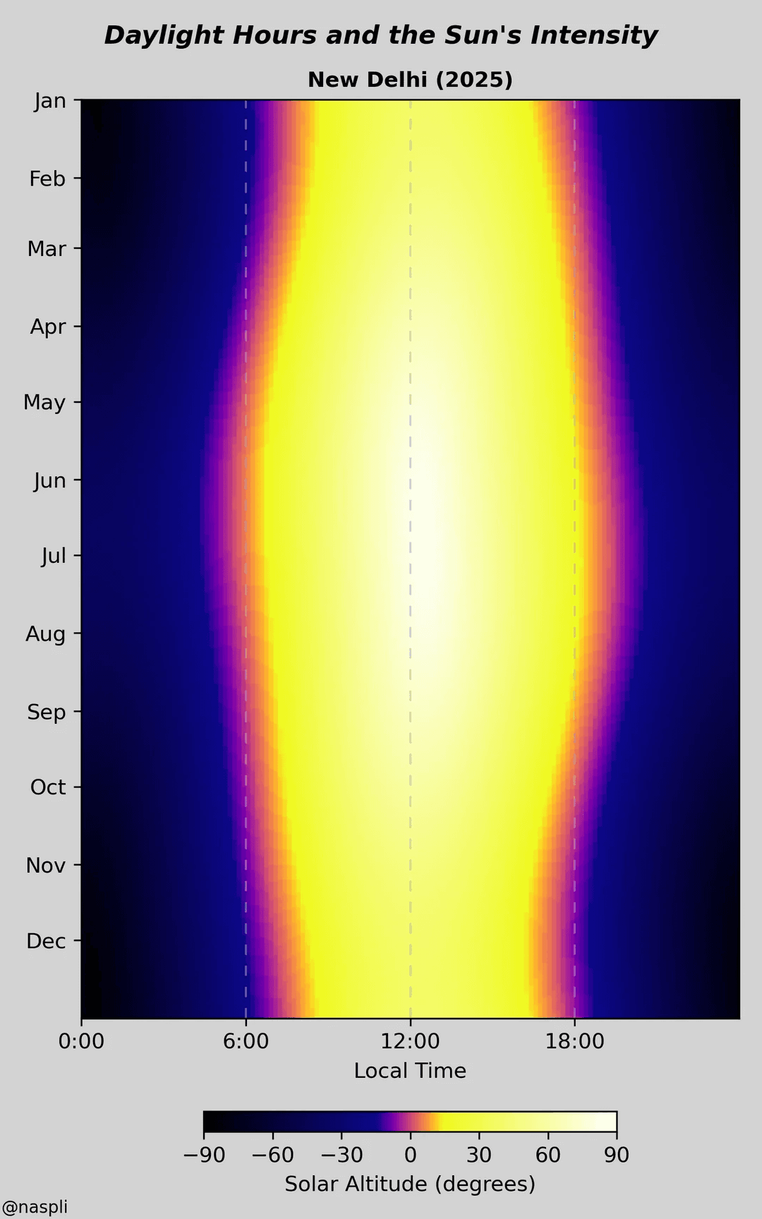
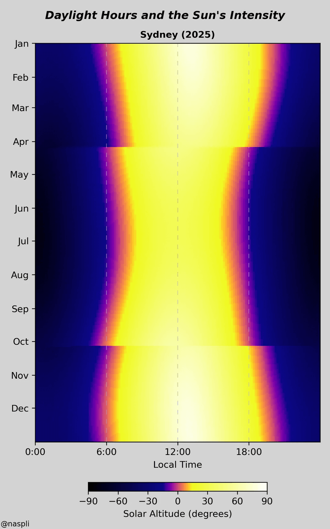
The differences between cities are fascinating. Singapore, near the equator, gets steady daylight all year. Reykjavik, much farther north, swings between short winter days and long summer nights. In cities like London, New York, and Madrid, you can even spot daylight‑saving time—the sunrise and sunset times shift slightly in spring and fall, and the chart shows it clearly.
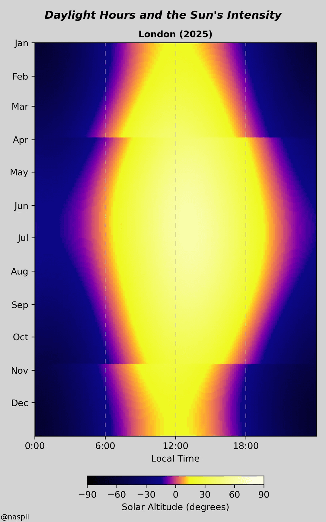
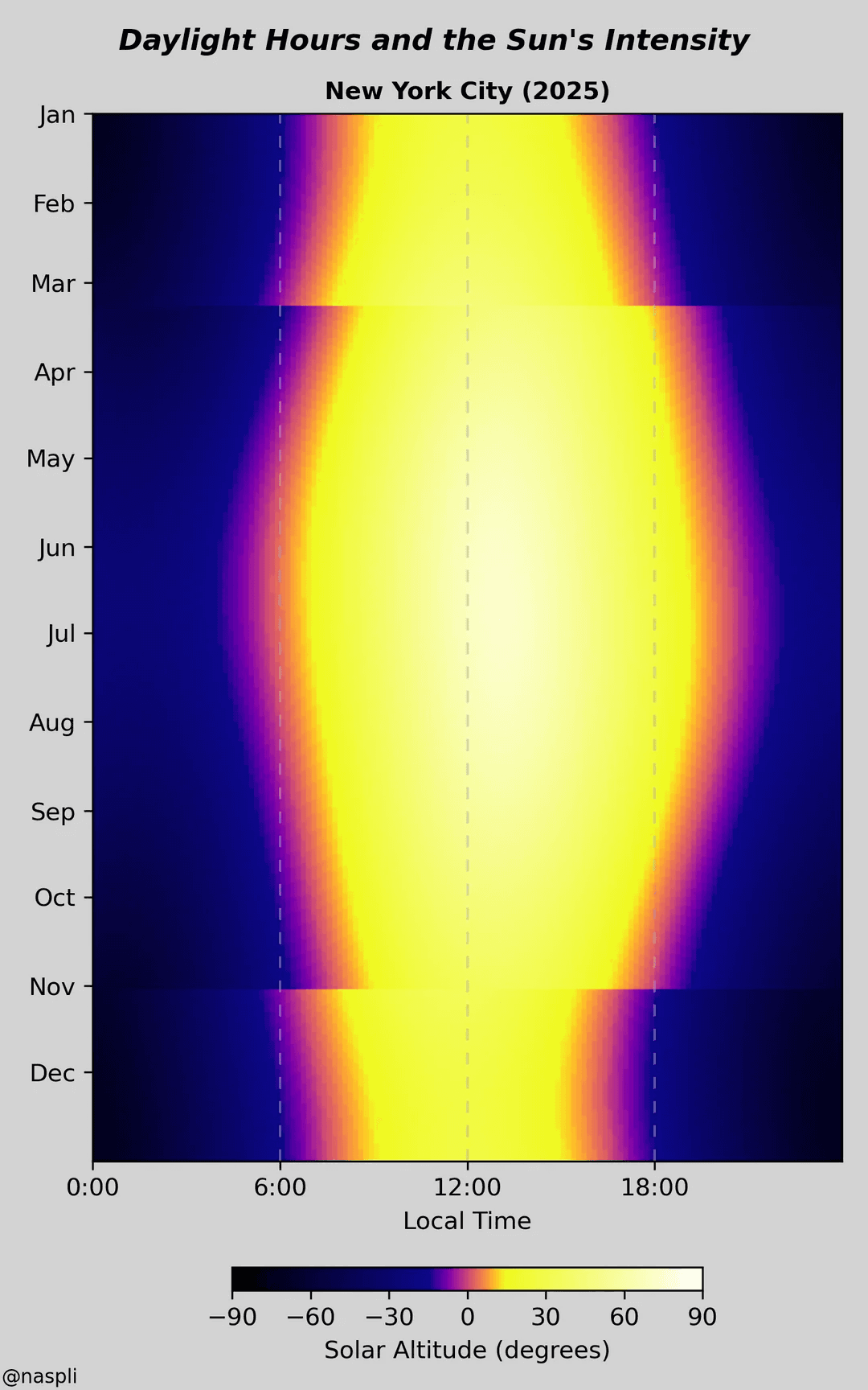
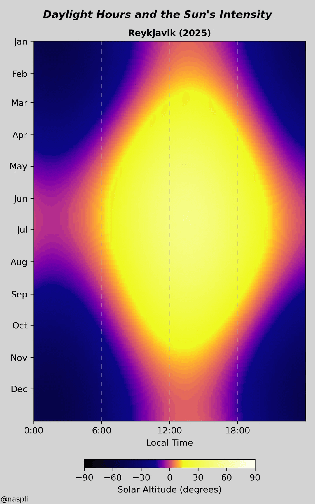
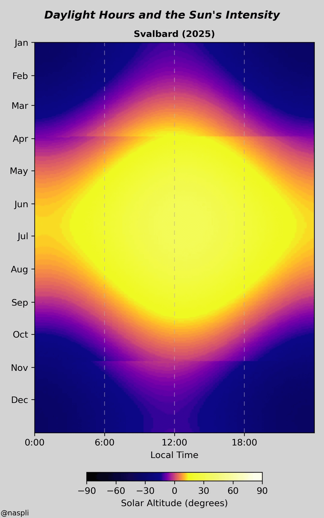
What works so well here is the simplicity. The color palette is easy to read, the layout is clean, and there’s no clutter. It’s a smooth experience—you don’t need to decode anything or read long explanations. You just get it.
Big credit to @naspli for turning complex data into something that’s both useful and beautiful. A great example of how good design can make a big difference in how we understand the world.