NBC's Grocery Price Tracker
The Mixed Story Behind Your Shopping Cart
January 27, 2026 • 3 min read
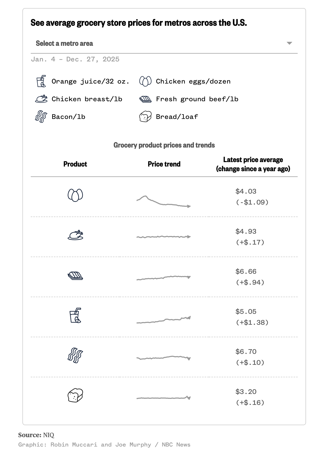
NBC put together a cool tracker that follows real grocery prices over time using checkout data. It shows how prices for common items like eggs, bread, orange juice, chicken and ground beef are changing over time.
It's really interesting to see how some items, like eggs, have dropped significantly from their peak prices and now sit below their levels from just a short time ago. Other categories like orange juice and ground beef are clearly higher today than last year.
The tracker also let's you can pick a metro area in the tracker to see how these trends vary locally which is a nice touch. Inflation isn't uniform across the country, and this lets you personalize the data to make it more relevant.
Now let's talk design...
The icons are clean black and white line drawings that make it easy to scan. Each item gets a small sparkline, basically a tiny line chart that shows how things are moving over time.
The sparklines work great for showing their purpose of showing the overall trend at a glance without overwhelming the reader without too many clutter. I'm a big fan of adding them to tables like this to give more context.
The sparkline gives you direction and pattern, but not scale.
If this were interactive, you could hover over the line to see the actual prices, click to expand the date range or zoom in, and pull up an axis when you want more detail. All of this keeps the default view clean while compensating for the lack of scale in the sparklines.