Same Data, Different Story
April 20, 2026 • 6 min read
I run data storytelling workshops and spend a lot of time with analytics and marketing teams, and the same pattern shows up every single time. A team opens a dataset, and within about ten minutes they've landed on a story that already feels obvious to them, half-written into the slide before anyone has really looked at the numbers.
Then I ask the room, "what else could this data be saying?" and the energy shifts. The honest answer is usually a lot of other things.
That's the whole point I want to make here. Dataviz is the craft of drawing the chart. Data storytelling is the craft of choosing which story it tells. They sit on top of each other, and most people conflate them, which is where things go sideways.
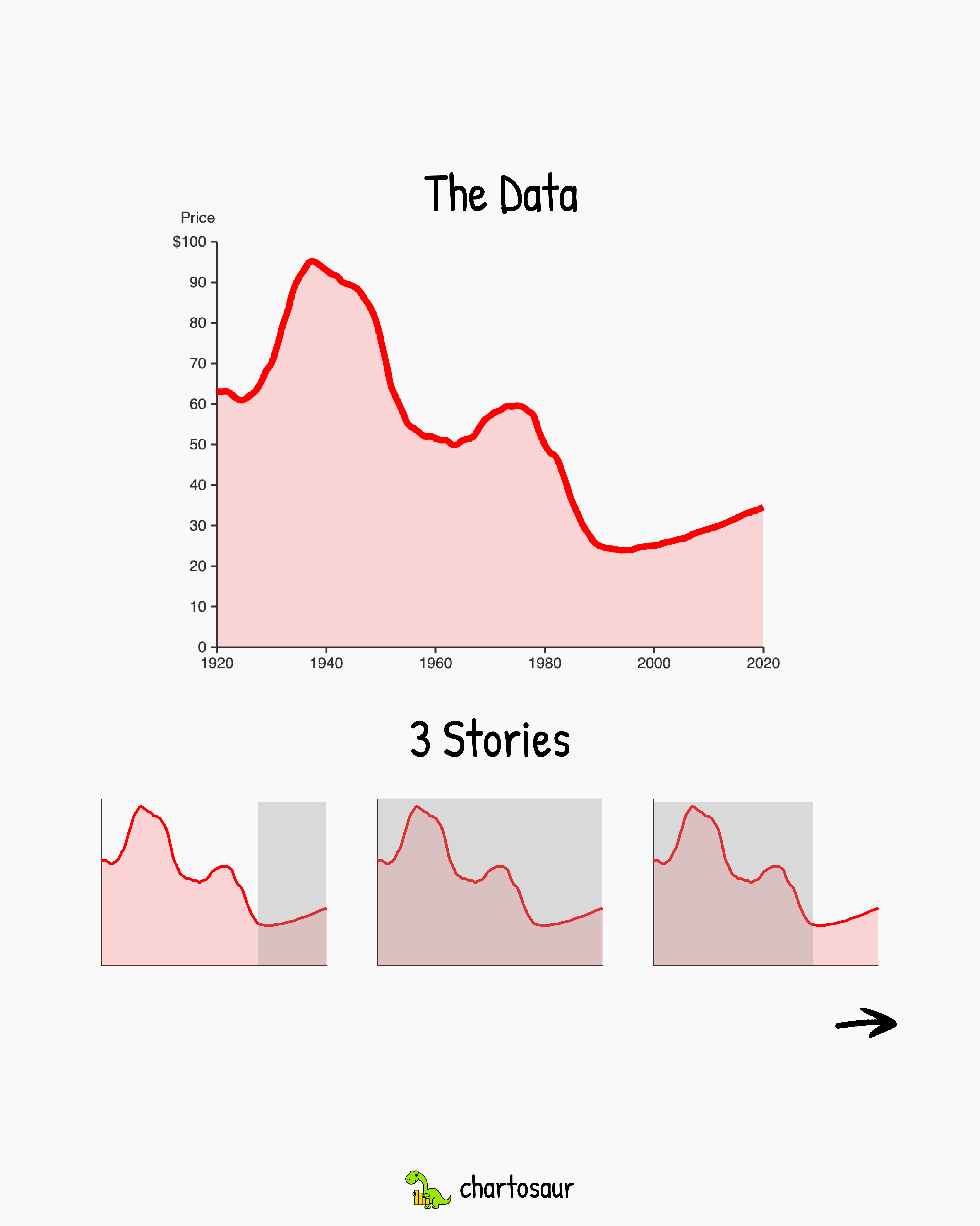
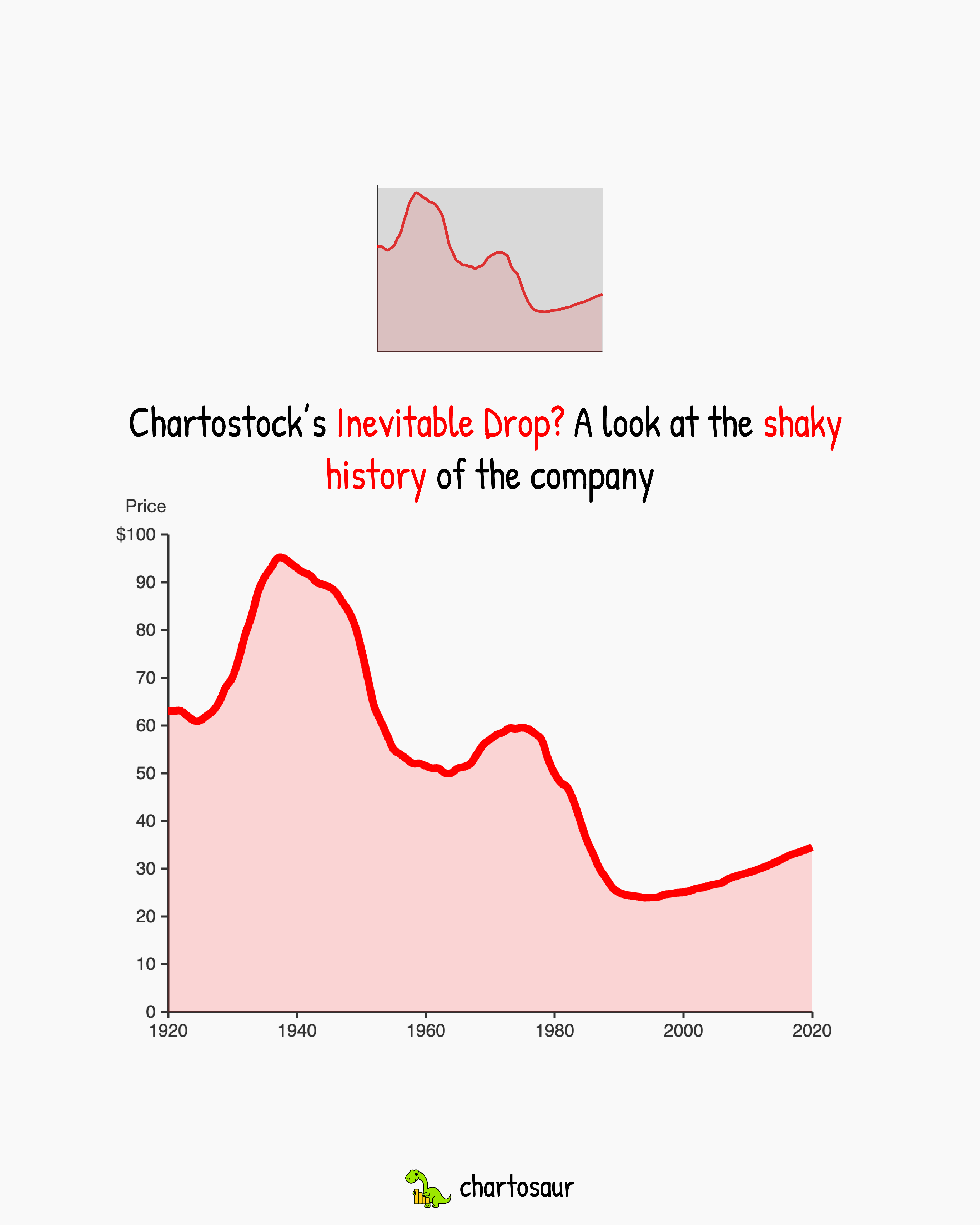
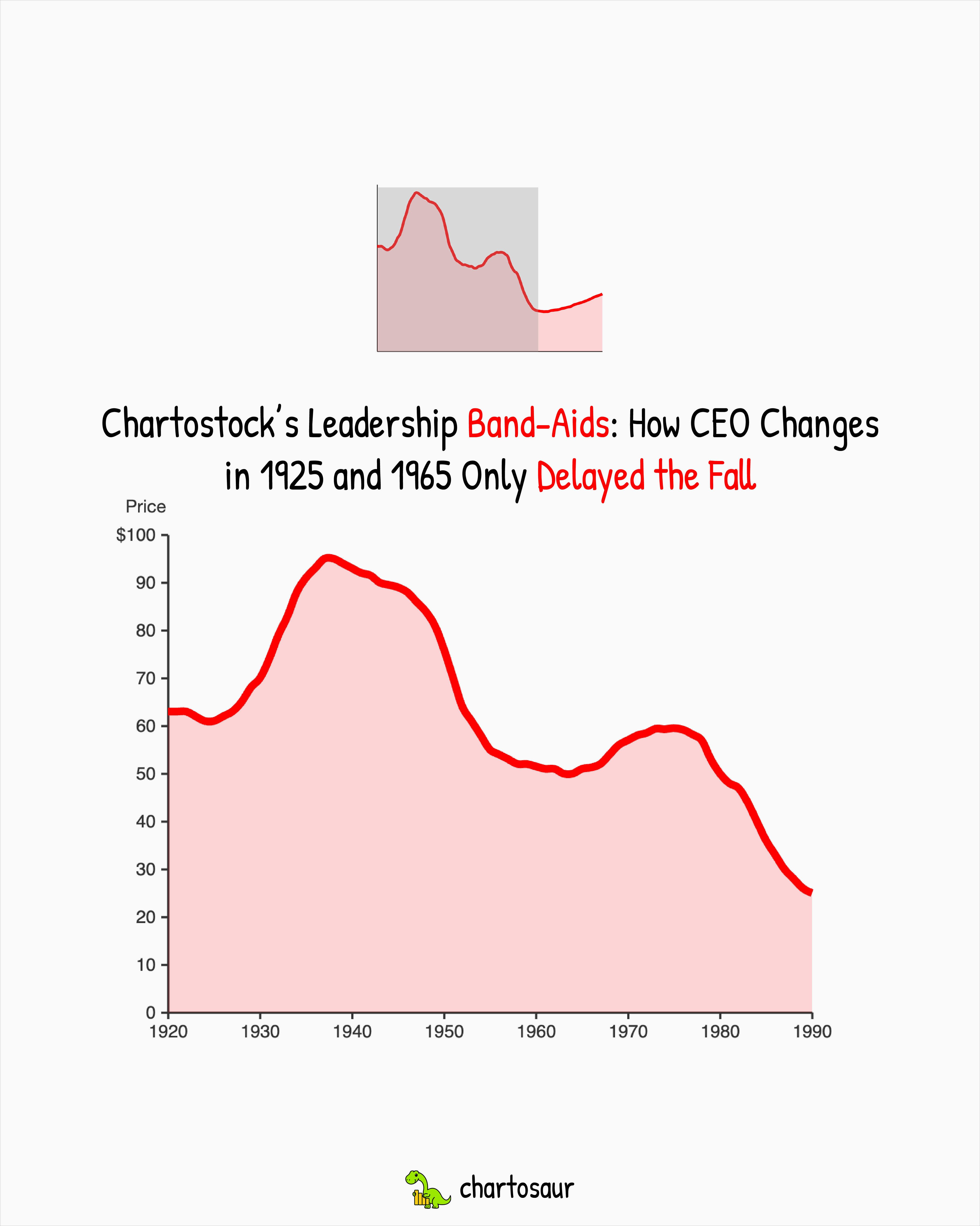
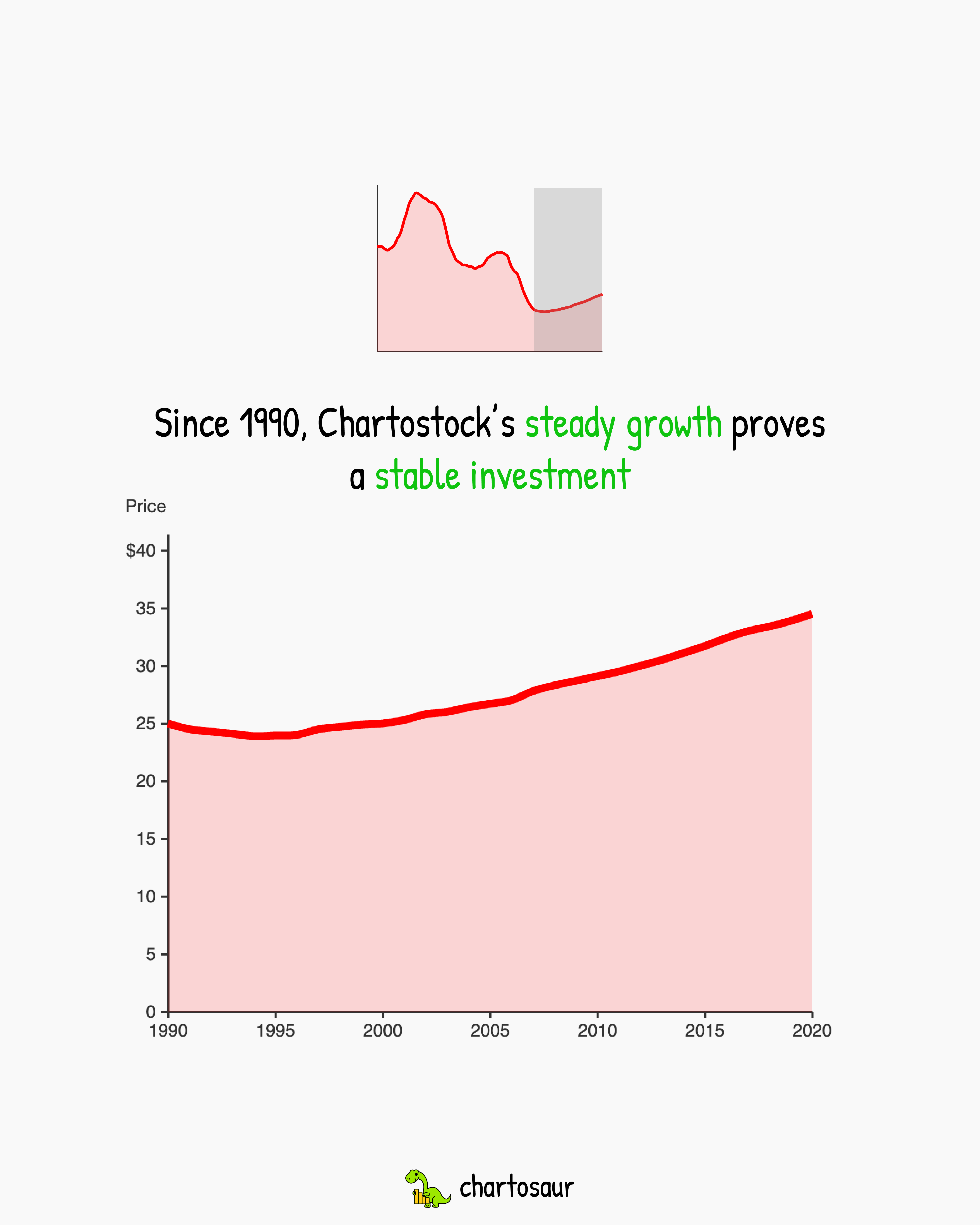
That's sample data I put together for my workshops. Same company, same prices, same source, and I can pull three completely different stories out of it depending on how I slice it: a century of decline, two leadership reshuffles that only bought time, or steady growth since 1990. None of them are lying, none of them are wrong, they're just different stories living inside the same numbers.
Numbers don't mean one thing
This is the part that trips people up. We're taught that data is objective, so the story must be objective too. It isn't. Data is raw material. A dataset can support a dozen honest readings, and it's remarkably easy to land on one that doesn't actually hold up as the strongest version of the story.
This is also why, off the exact same economic release, one political side can say the economy is booming and the other can say it's cratering, and both of them can be showing real numbers from real slices of the data. Neither is technically lying, they're just framing the same numbers toward the story they already wanted to tell.
The bias shows up before the chart does
The part that surprises teams in my workshops is how early the bias kicks in. People tend to assume bias sneaks in at the design stage, when you pick the chart type or the color, but by that point it's usually far too late. It's already there before anyone opens the file.
Someone walks in believing churn is a pricing problem. They'll find the pricing story in the data. Someone else walks in believing it's an onboarding problem. Same dataset, same meeting, and they'll surface the onboarding story. Neither of them is cherry-picking on purpose. They're just running the analysis through the lens they brought in with them.
I see this constantly. Teams hire the chart to confirm what they already suspect. The chart obliges, because a dataset this rich will always have something that looks like confirmation.
The classic: cutting the history
The cleanest real-world example of this is one I wrote about in my five misleading charts piece. The Daily Mail ran a chart starting in 1997 with a headline that said "Global warming stopped 16 years ago."
![[object Object]](/_next/image?url=%2Fblogs%2Fmisleading-news-charts%2Farticle-2217286-157E3ADF000005DC-561_644x358.jpg&w=3840&q=75&dpl=dpl_J2PmofTT1qPAhZEnNnbdnK3FejMe)
The data is real and the chart is real. 1998 was a peak El Niño year and a statistical outlier, so if you start your chart at the highest point you can find, everything after it will naturally look flat. The warming trend hadn't stopped, the starting point was just dishonest.
Zoom out to 150 years and the story completely flips, same dataset, different window, different story altogether.
The role of a title
The title is one of the most important parts of a narrative driven chart. It's where you tell the reader what to do with the numbers in front of them, and it's doing a lot more persuasive work than most people give it credit for.
There's nothing wrong with a descriptive title like "Quarterly revenue by region" and there's nothing wrong with a power title like "The West region carried Q3" either. They're just doing different jobs. A descriptive title tells you what you're looking at, a power title tells you what to take away from it.
The thing I push teams on isn't whether to use a bolder title, it's whether the title is defensible against the data. A power title that matches what the numbers actually support is usually the clearest version of your chart, because it takes a stance and helps the reader get to the insight faster. A power title that stretches past what the data supports is where you quietly cross into misleading people, even when every number on the chart is real.
Your title also sets the reader's search task without them knowing. If the chart is titled "why did Chartostock collapse?" the eye hunts for the fall. If it's titled "how stable has Chartostock been?" the same eye goes straight to the flat stretches of the same line. You can flip how a chart gets interpreted by rewriting nine words at the top of it, which is why the title deserves as much thought as anything else on the page.
How to not fool yourself
You can't eliminate bias. Your brain isn't built for it. But you can build a few habits that catch the obvious mistakes before they ship. These are the ones I drill in every workshop:
Write the opposite headline first. Before you commit to a story, force yourself to sketch the chart that argues the other side. If the opposite story also holds up in the data, you don't have a conclusion yet. You have a preference.
Name your starting assumption out loud. Something like "I think churn is a pricing issue" at the top of the doc. Once it's named, it stops steering your analysis quietly in the background.
Interrogate the window. Why does the chart start where it starts, why does it end where it ends, and if the answer is "because it looks cleaner," then you've already picked a story and you should own that or change it.
Bring in someone who'll push back. Find the person on the team who's going to ask why the axis starts where it starts, why the comparison is what it is, and what you left out. The best charts I've seen almost all survived one uncomfortable meeting before they shipped.
The real craft
Good dataviz is a prerequisite. Clean axes, honest scales, the right chart type for the job. That's the floor. Data storytelling is the layer on top, and it's where almost all the persuasion actually happens.
The teams that get this right don't pretend to be neutral. They know they're making choices. They pick the story on purpose, back it with the data honestly, and put the frame in plain sight so the reader can see it too.
A chart stops being a chart and becomes a story the moment someone picks what it's trying to say. Your job is to make sure the story you picked is the best fit for your use case and defensible against the data you actually have.