A Simple Trick to Make Heatmaps More Useful
August 23, 2026 • 5 min read
I find myself coming back to heatmaps whenever I am working on an analysis that has a lot of values over two dimensions. Instead of reading through hundreds of individual values, a heatmap allows you to see the structure of the data easily.
Take the following chart as an example that plots support tickets by type over a full year. I can, at a glance see which issues are consistently driving volume, where there are sudden spikes in the data, and which weeks look unusually busy.
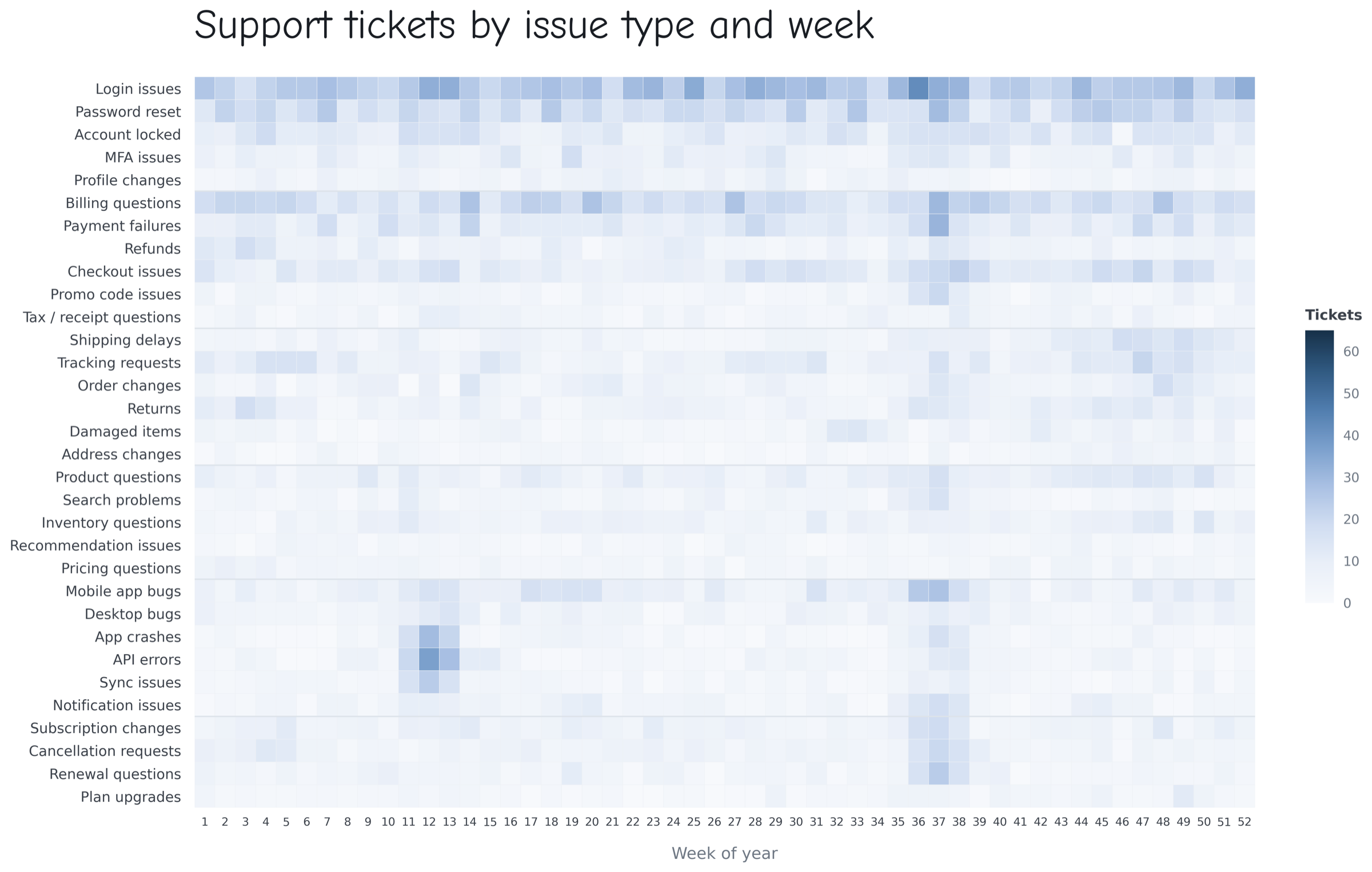
But there are a few questions that the heat map makes it hard to answer. In the example, I can tell that weeks 12 and 37 had some big spikes around them, but I can't easily tell with confidence which week was worse.
One way I might normally solve that is by sorting the columns by total volume. But here the columns represent weeks of the year, so their order actually matters. Rearranging them would make the heatmap harder to understand.
Instead, I can keep the chronological order and add a small bar chart above the heatmap that sums the values in each column. These kinds of charts that sit along the edge of a main visualization are often called marginal plots. They’re typically used to augment the main visualization by adding context or surfacing a supporting metric that helps you better understand the story in the data.
In this case, we simply added up all the support tickets for each week. I still get the detail from the heatmap, but now I can also quickly see how busy each week was overall.
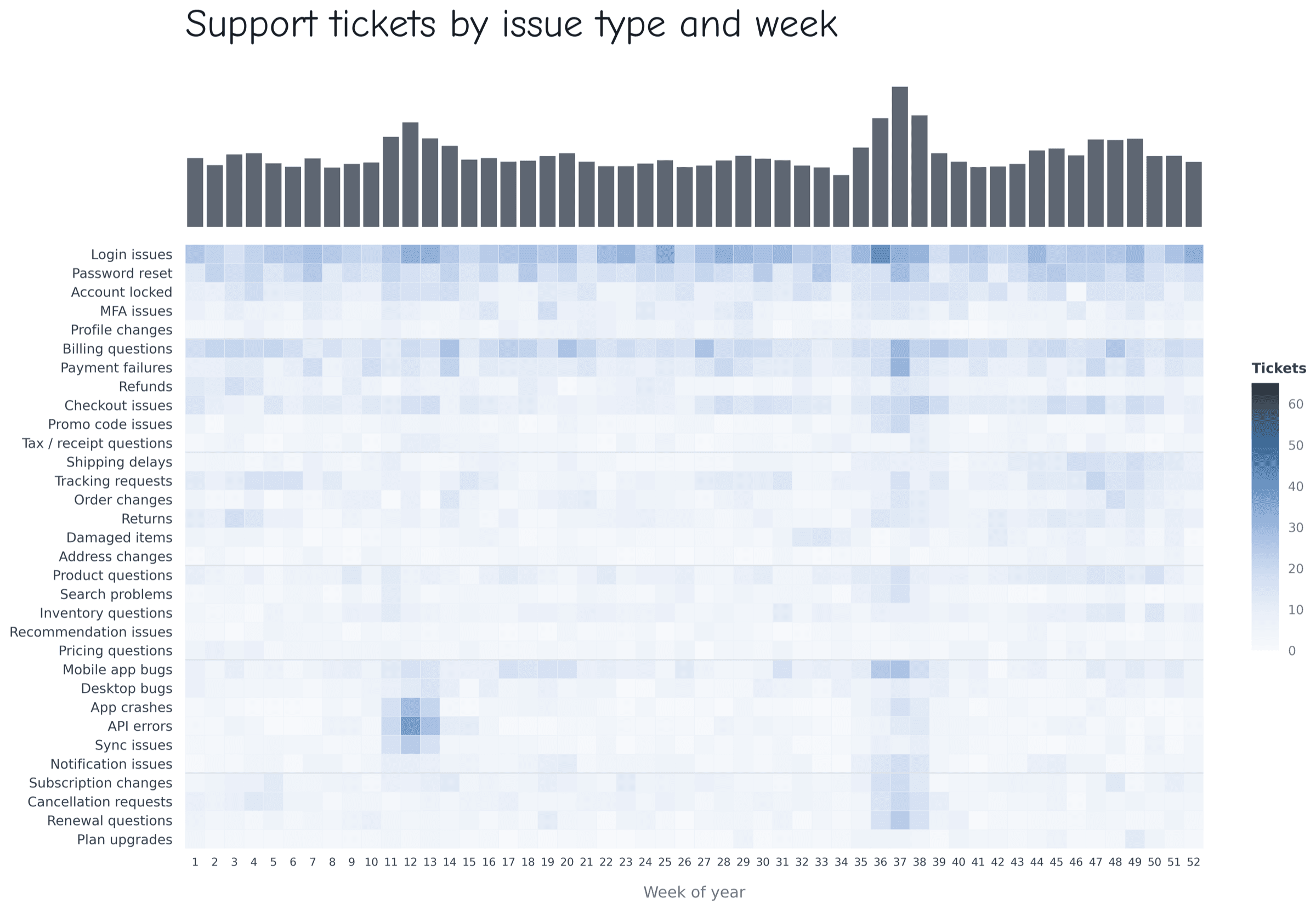
And now with the marginal chart, the answer which week was worse is clearer. Week 37 was clearly worse overall even though week 12 had some darker individual spikes.
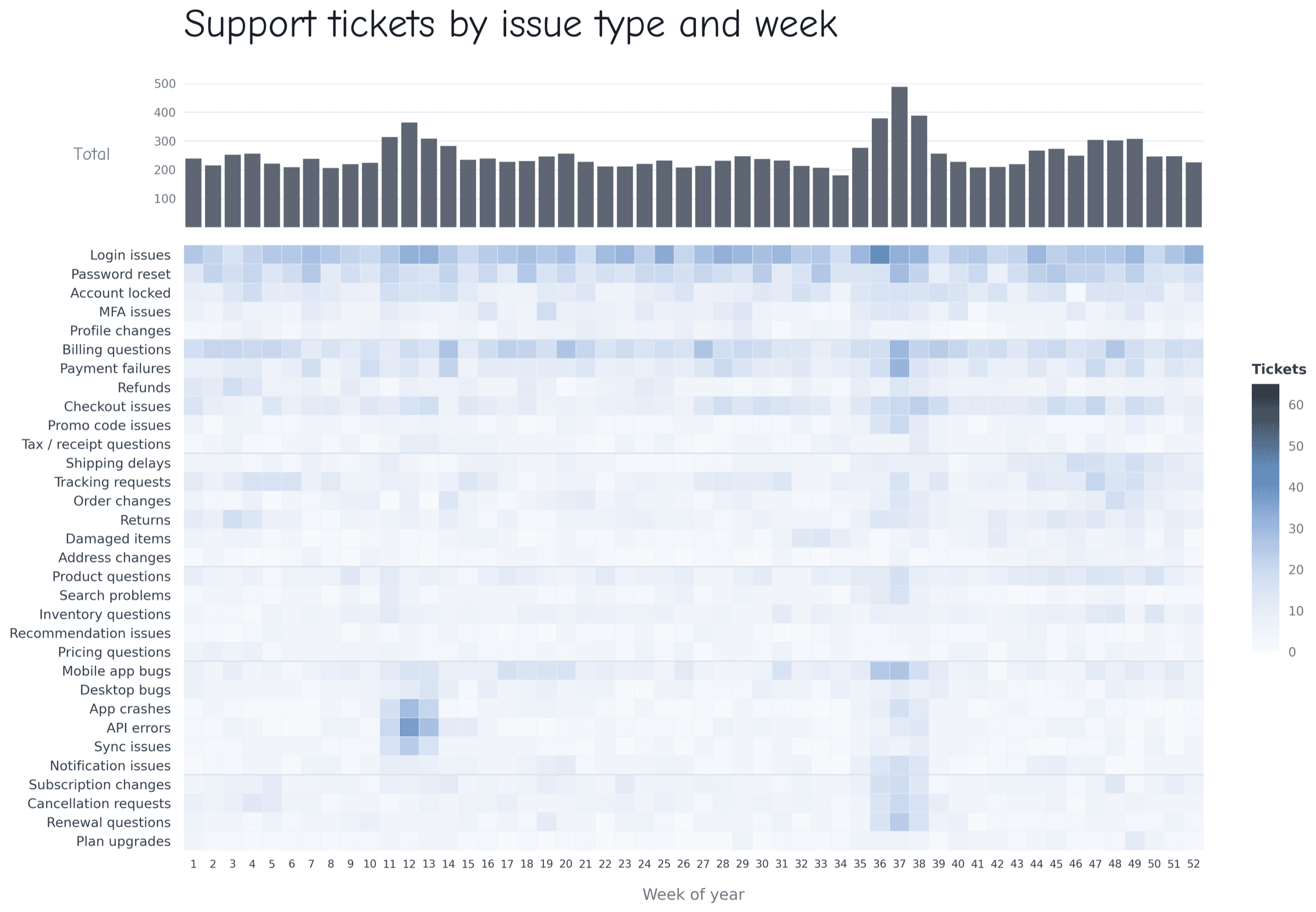
If I want to make those comparisons a little more precise, I can also add a few subtle gridlines that make it easier to judge how large the differences actually are.
The same idea can also work along the y-axis. Here the issue types are grouped together in a meaningful order, so I may also not want to simply sort the rows by total ticket volume. Instead, I can preserve that structure and add another marginal bar to the right that summarizes each row.
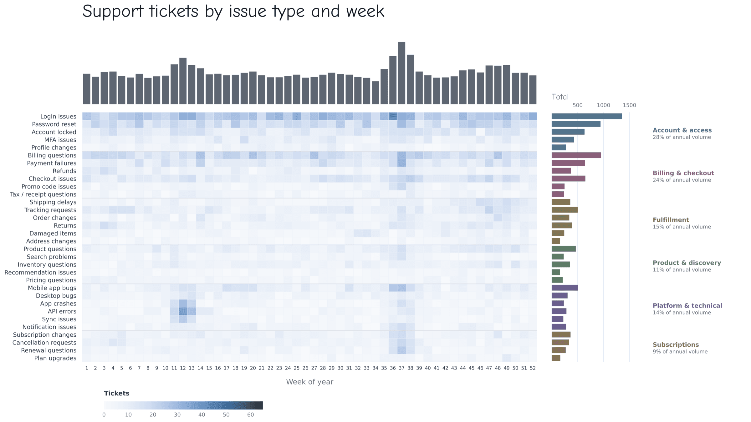
Since these rows already fall into broader issue families, I can use color to carry that grouping into the bars as well. In this case, the right side doesn't just tell me which issues are the largest, but it also shows the audience a specific part of the story that they can immediately focus on.
Case study: Measles in the United States
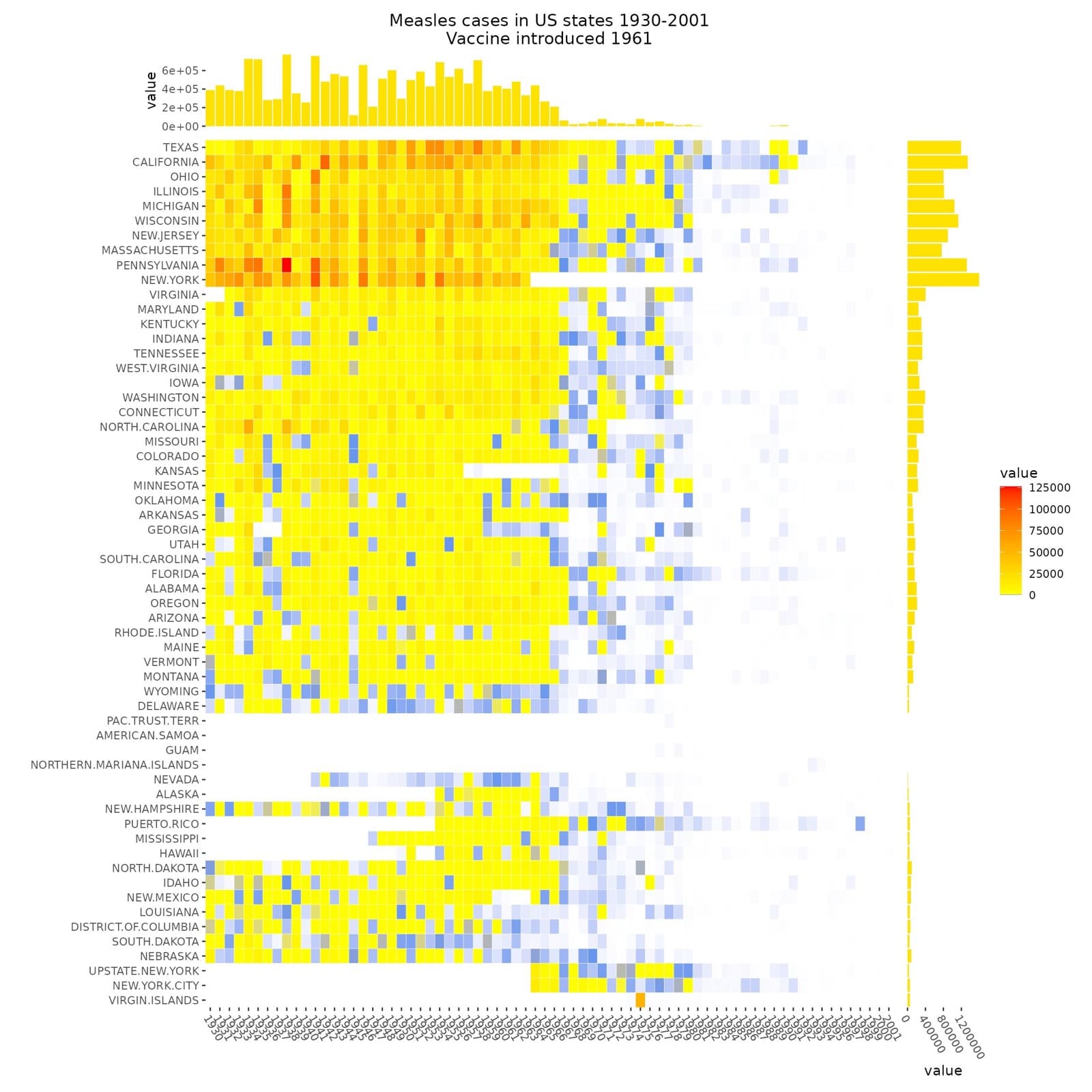
I came across this heatmap by JoachimSchork on X that plots the reported measles cases across states over time. The drop in cases after the vaccine was introduced is already visible in the heatmap, but the marginal charts across the top allows the audience to focus on how dramatic that change was.
The bars on the right add another layer by showing which states had the highest case counts overall. It is a good example of using the space around a chart to guide attention toward the parts of the story you want people to pick up on first.
How to build marginal plots
The nice thing is that you usually don’t need a special package just for marginal plots. In most tools, you’re really just building a second chart and lining it up with the same rows or columns as the heatmap.
- Excel: Create the heatmap with conditional formatting, calculate row or column totals with SUM(), then use a small bar chart or Data Bars to create the marginal.
- Python: seaborn.heatmap() works well for the heatmap, and Matplotlib GridSpec gives you the control to place smaller bar charts above or beside it while keeping everything aligned.
- R: ComplexHeatmap has this idea built in and makes it easy to attach bar charts and other annotations directly to rows or columns. If you’re already using ggplot2, you can also build the pieces separately and combine them with patchwork.
- Plotly: You can put a heatmap and bar charts into the same figure with make_subplots(), which is also useful if you want the final version to be interactive.